Brand preview
Connect5 logo color options that stay inside the site palette
All three directions keep the current site blue and avoid looking disconnected from the beige, slate, and soft industrial tone of the website.
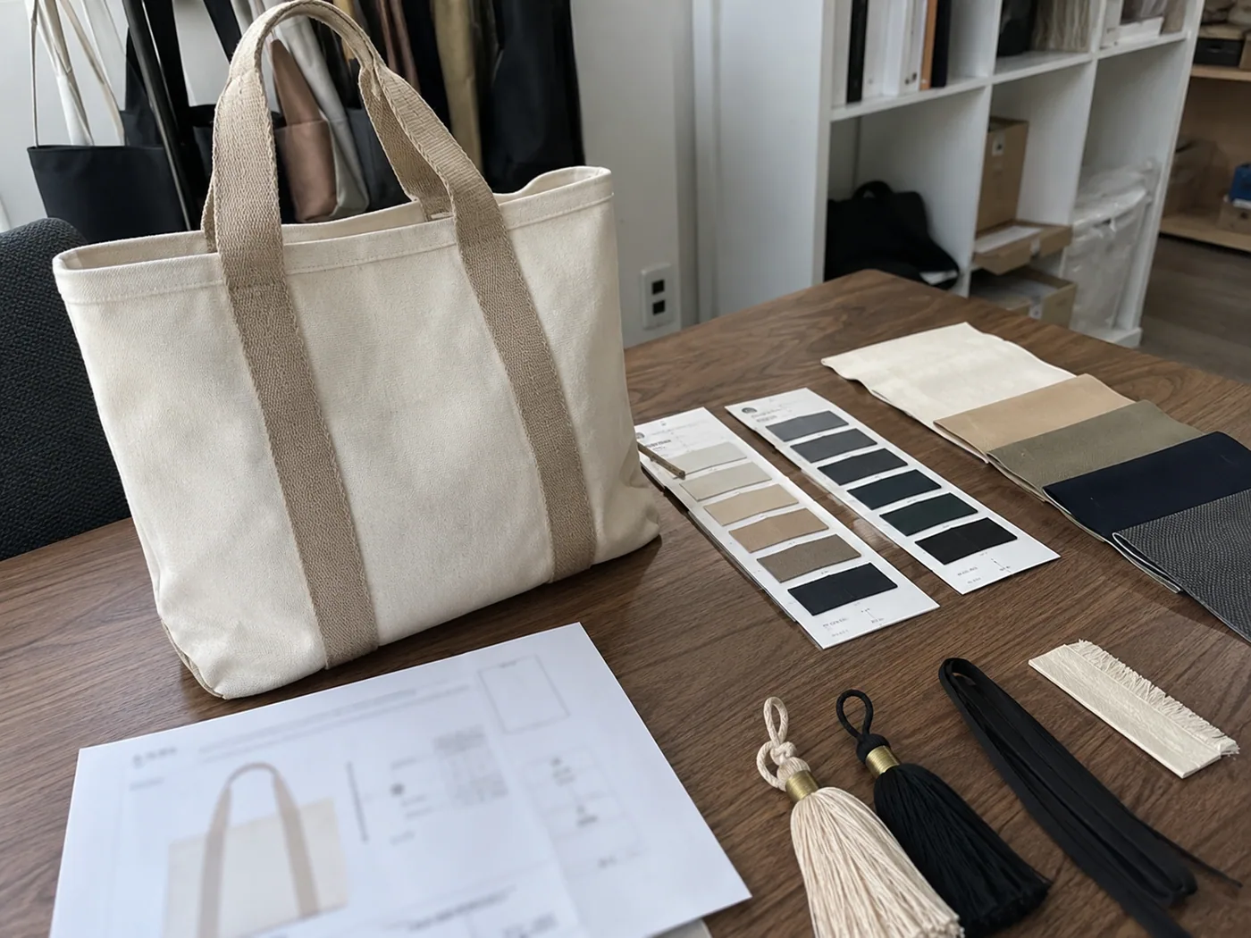
Logo application visual
Compare logo colors across patch, label, plate, and bag-application directions
This internal preview uses an illustrative material-and-placement reference to compare how each palette may read across common application formats.
Option A
Blue + Warm Stone Accent tone #9f8a74
最稳,和站点米白底最贴近,质感温和,不会跳出页面。
适合你想保留高级感,但把现在的黄铜感收敛一点。
Option B
Blue + Champagne Sand
Recommended
Accent tone #5f7896
比现有蓝黄更柔和,但仍保留品牌识别度。
如果你想继续带一点 premium 感,这是我最推荐的一版。
Option C
Blue + Tonal Blue Accent tone #4c6f98
完全收敛到站点同色系里,最商务,也最 B2B。
适合你想让 logo 更现代、更克制,减少任何偏装饰性的暖色。
We use optional scripts only after consent. Essential site functions stay on. Analytics, marketing measurement, and live chat session storage are optional and can be changed later. Privacy policy
Reject non-essential Accept all
Cookie settings